KRISTIN ACHESON
Conducting Analytics On A Radio Chart Using Python and Z-Score Analysis
Code:
import numpy as np
import statsmodels.api as sm
import pandas as pd
import matplotlib.pyplot as plt
file_path = 'FinalProject.xlsx'
df = pd.read_excel(file_path)
df.columns = [col.strip().upper() for col in df.columns]
df['LW AUDIO'] = pd.to_numeric(df['LW AUDIO'], errors='coerce')
df['TW AUDIO'] = pd.to_numeric(df['TW AUDIO'], errors='coerce')
df['TW SPINS'] = pd.to_numeric(df['TW SPINS'], errors='coerce')
df = df.dropna(subset=['LW AUDIO', 'TW AUDIO', 'TW SPINS'])
X_audio = df['LW AUDIO']
y_audio = df['TW AUDIO']
X_audio = sm.add_constant(X_audio)
model_audio = sm.OLS(y_audio, X_audio).fit()
X_spins = df['TW SPINS']
y_spins = df['TW AUDIO']
X_spins = sm.add_constant(X_spins)
model_spins = sm.OLS(y_spins, X_spins).fit()
audio_summary = model_audio.summary()
spins_summary = model_spins.summary()
plt.figure(figsize=(12, 6))
plt.subplot(1, 2, 1)
plt.scatter(df['LW AUDIO'], df['TW AUDIO'], color='blue', label="Data points")
plt.plot(df['LW AUDIO'], model_audio.fittedvalues, color='red', label="Fitted line")
plt.title('Regression: LW Audio vs TW Audio')
plt.xlabel('LW Audio')
plt.ylabel('TW Audio')
plt.legend()
plt.subplot(1, 2, 2)
plt.scatter(df['TW SPINS'], df['TW AUDIO'], color='green', label="Data points")
plt.plot(df['TW SPINS'], model_spins.fittedvalues, color='orange', label="Fitted line")
plt.title('Regression: TW Spins vs TW Audio')
plt.xlabel('TW Spins')
plt.ylabel('TW Audio')
plt.legend()
plt.tight_layout()
plt.show()
print("Regression Summary for LW Audio vs TW Audio:")
print(audio_summary)
print("\nRegression Summary for TW Spins vs TW Audio:")
print(spins_summary)
Output
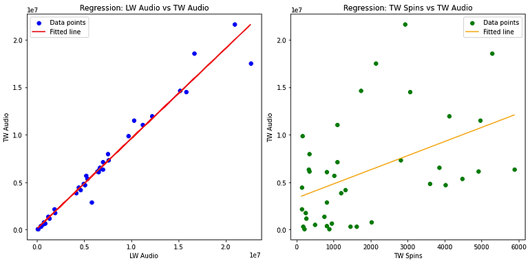

Insights From Analysis
Key Insights
- Last week streams are a far better indicator of this week streams
- Spins don't have a high correlation to the amount of audio streams
- The Z-Score analysis shows that the data doesn't contain large amounts of outliers
Further Actions
- Focus less on amount of spins to getting more overall streams
- Identify which streaming modes lead to the same amount of streams each week
- Using the data with abnormal z-scores identify the largest disparities between those songs and the songs we are trying to push at radio
Further Questions
- Which other variable could be more aligned with streams in the data set?
- What variables have the highest correlation with songs that have the similar amount of streams each week?
- Why did the songs with outlier's perform better or worse than our songs?